
topo
The new INOKEM is disruptive, without limits, a more appealing shop experience and the same savings and efficiency as ever.

New logo
The main logo only focuses on the existing INOKEM wordmark from the previous logo. The purpose of this change in the logo was to achieve a more modern and disruptive idea, in order to bring the brand closer to the target audience and also simplify a previously cumbersome logo. The green and purple colors have been carried over to this new logo.
Previous logo


Logo variables on complex background
Typography

MAIN TYPOGRAPHY
The typographic font used in the wordmark “INOKEM” is the font “Gotham” in Black style. The new logo is a metamorphosis of the old logo. The same typography was used in the new creation to maintain one more identifying element of the brand (in addition to the identifying colors). This font is only used in the logo.

SECONDARY TYPOGRAPHY
Colors


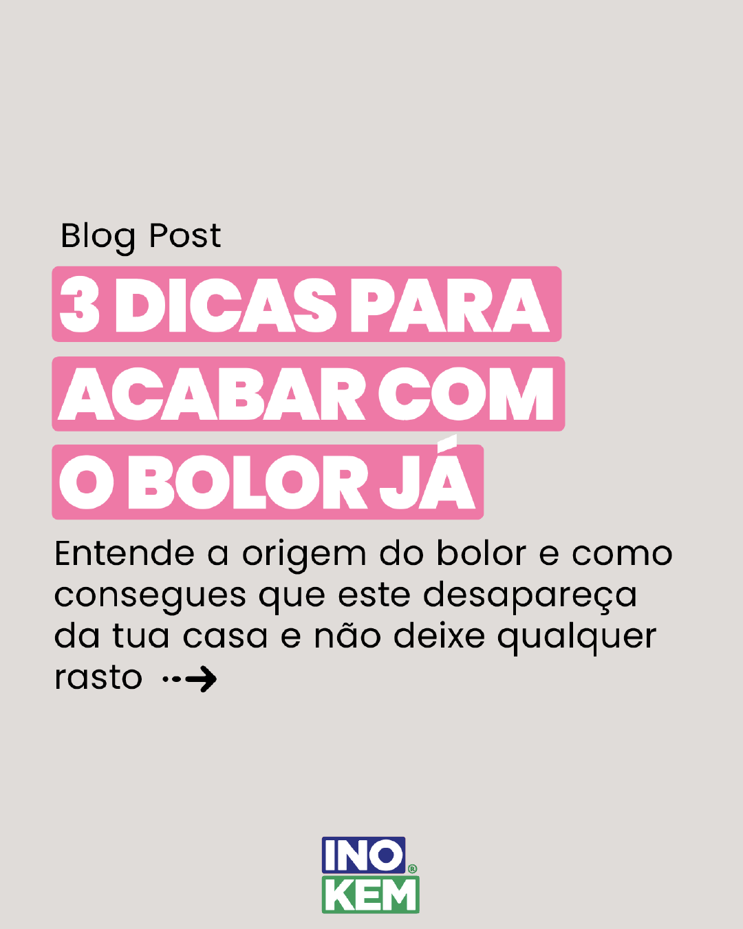
Social Media
POSTS TEMPLATES

GRID


Website
POSTS TEMPLATES